Visual Identity
The logo
Use of the logo
The Scuola Normale has registered the trademark, logo, name and distinctive signs, which can only be used under the SNS license. The SNS logo can be used by:
- governing authorities and administrative, teaching and research structures of the Scuola Normale in every area where it is necessary to clearly identify the SNS as the author or source of documents of various types, both of an institutional and scientific nature;
- students for their title page of their undergraduate or PhD thesis, to demonstrate their belonging to the student and scientific community. The use of the logo is allowed to students also for initiatives approved and funded by the SNS;
- institutions or bodies that organize joint initiatives with the SNS;
- organizers of conferences, congresses and cultural events, which have obtained the patronage of the SNS;
- anyone who is entitled under the Statute and the Regulations of the SNS.
In any case, the request for the logo must be sent to the Communications Office. A graphic draft of the logo must then be sent to the latter Office for approval. The use of the logo must always respect these guidelines of visual identity.
The use of the logo by members of the community (research staff, technical-administrative staff and students) for private activities or in any case those which are not strictly institutional is expressly prohibited.
How to use the logo
The logo is an essential element for the visual identity of the Scuola Normale. It acts as a recognizable and unique signature, and must be used consistently in all documents.
The logo of the Normale is composed of a pictogram – the “stefaniano” Medici coat of arms designed in 2005 by Andrea Sportiello for the Rovai Weber Agency, which at the time designed the coordinated image of the Scuola Normale – and the denomination, Scuola Normale Superiore, for which the font Rotis semiserif AT has been used, aligned to the left.

The SNS logo is available in pdf and jpg format to allow easy use by common or professional users. It has 4 declinations obtained from the combination of the horizontal/vertical and colour/shades of gray variants. The colour of the logo, introduced by the HDRÀ agency in 2018, is a PANTONE 314 U; the monochrome version is a PANTONE 431 C or NERO 70%.

Pictogram and name cannot be separated; the separate use of these two elements is exceptional, and can be carried out exclusively by the Communications Office for sporadic and specific cases.

Substituting the font or the pictogram is not allowed.

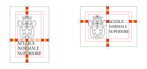
The distance between the pictogram and the name is one unit of measurement. The latter represents the module used to find all the other distances.
The buffer zone, in height and width, is made up of 3 units of measurement.

In the vertical version the minimum size to ensure legibility is 20 mm in height, while in the horizontal version it is 15 mm.

The structure of the logo cannot be modified: the order or the proportions of the elements cannot be changed; the logo can be enlarged or reduced but it must maintain its proportions.

It is not allowed to change the colour of the logo or add other graphic or chromatic elements.

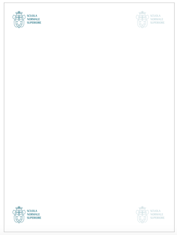
Throughout the document, the logo should be placed at the top left or, alternatively, at the bottom left. Where this is not possible, it can be placed in the other two corners

Occasionally the logo may be placed in the centre, bottom or top of the page. For example on posters or flyers where the text is centre aligned.
Colour palette
Colour plays a very important role in the visual identity of the Scuola Normale, and consistency is also fundamental in the chromatic approach. A colour palette is associated with the institutional colour.

In addition to the core colours, there are compliment colours and accent colours that can be combined to communicate in a wide range of tones.

For your convenience, you will find here below the hexadecimal, CMY and NRGB codes corresponding to the institutional shades:
HEXADECIMAL. CMY. NRGB.
#00728D (petrol blue) 100 7 23 33 0 114 141
#4D4E4F (dark gray) 63 52 50 46 77 78 79
#FFFFFF (white) 0 0 0 0 255 255 255
#183F56 (dark blue) 94 66 42 38 24 63 86
#C8CAD4 (light gray) 25 18 13 1 200 202 212
#9CD7F3 (light blue) 42 1 2 0 156 215 243
#AB3502 (red) 23 87 100 17 171 53 2
#4B70FF (purple) 78 60 0 0 75 112 255
#E69426 (orange) 8 47 91 1 230 148 38
Body of the text
The font used for the body of the text of the website, stationery and BTL material is Roboto Condensed.
For institutional communication titles use Rotis Semi Serif.
Raleway can be used for the titles of BTL material.
For internal communication use Arial. Please use preferably black or gray (# 444444 R68 G68 B68).

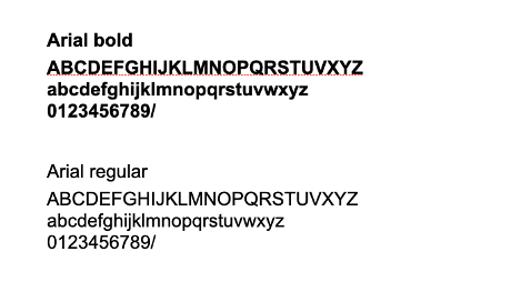
To make communications via email consistent, use Arial (Sans Serif in gMail) bold and regular.

Useful materials
The communication guidelines were drawn up in order to clarify the communication system of the Scuola Normale Superiore. In addition, they are a support tool for the SNS community for the inclusion and support of the promotion of the co-ordinated image of the Scuola Normale Superiore in an aware and creative manner, within the system described.
For this reason some resources (at the implementation stage) useful for a communication in line with the co-ordinated institutional image (fonts, slide templates, letterhead, title page of PhD (.docx e .tex) Theses, photographs, backgrounds for videocall) are made available to SNS users. We urge a coherent use of these guidelines and of this visual identity manual. The official presentation of the Scuola Normale is also available (slides ITA/ENG, in pdf).
Below are some preliminary instructions for the use of the materials.
The fonts
Downloading and installing on your computer(s) the institutional font and that used for the running text (body text) makes it possible to utilise the PowerPoint template, or to produce official documents in their correct format.
We thus recommend as a priority action the installation of the two fonts and the restarting of the Office/iWork apps before their use.
The institutional font should be used sparingly. It is a recognisable but formal font, to be utilised solely for the titles and for any subtitles but not for the running text.
If documents are created that are to be shared on devices on which the two fonts cannot be installed, texts and PowerPoint presentations can be saved in PDF to preserve the format or Arial can be used, to avoid incompatibility.
PowerPoint/Keynote slide templates
The official templates available are in the two formats 4:3 and 16:9 (inside which you will find two possible colour combinations: just blue, and blue and orange) and, for each of these, two font use options: those of the SNS (Rotis Semi Serif and Roboto condensed) and with Arial, if you are using a computer on which the SNS fonts have not been installed.
In accordance with the guidelines, we advise you not to utilise any other fonts; if you cannot use the SNS fonts, the only other alternative is Arial, which is compatible with all systems.
In order to visualise and utilise the correct fonts in the slides, remember to install Rotis Semi Serif and Roboto Condensed on your computer(s) and restart the PowerPoint or Keynote app before opening the templates.
If the slides are shared on devices on which the two fonts cannot be installed, PowerPoint/Keynote presentations can be saved in PDF to preserve the format, or the option with Arial font can be used as an alternative, to avoid incompatibility or accidental changes in the settings.
For the use of the text colours and any infographics, tables or visuals, please refer to the palette as indicated.
The photographs
The file contains some photos of buildings and spaces of theScuola Normale Superiore that may serve as an accompaniment to your institutional presentations.
These are but an infinitesimal part of an extensive archive at the disposal of the Communications Office, which you can contact should you need a more extensive supply of images or further support for the planning of complex presentations.
The logo
The official logo of the Scuola Normale Superiore is designed in four variants (colour/range of grey, horizontal/vertical).
There are also two variants in white (horizontal/vertical), to be used only if the background colour on which the logo is to be placed does not allow for adequate legibility for the colour/range of grey variants. For a correct graphical and contextual use of the logo, you should consult the section of this visual identity manual. The logo cannot be directly downloaded in the variants available, but can be requested (specifying the use required) at comunicazione@sns.it.
The presentation of the Scuola Normale
The official Scuola Normale Superiore presentation slides, in Italian and English, are available. The data is updated on 31 December each year or, in the event of significant changes, as soon as possible. The format in which the slides are available is pdf, to avoid incompatibility with the various operating systems. Please do not make any changes, cuts or additions of any kind: should any changes be necessary please write to: comunicazione@sns.it
Contacts
For any queries or requests, you can contact the Communications Office:
comunicazione@sns.it.
